Journal Magazine
a Mór Partner
A digital lifestyle magazine focused on sustainable and small business culture across the UK and promoting the best in 'life's little luxuries'. A shout out to the small brands shaking things up across the island. As Lead Content Designer for both the online publication and its social medias, my goals were to continue to grow the reach of the platform, while strengthening the visual identity and improving the digital user experience. Through a robust organic social media and content strategy and refined UX on the main publication, we were able to grow social followings by about 10-20% and improve bounce rate on the website. We found success with numerous vendors and businesses reaching out for paid partnerships / advertising, generating potential for a new revenue stream.

01. Improving UX & Branded Web Design
____________________________________
____________________________________
Findings:
Through initial site audits and meetings with the writing / content team, I identified a few areas we wanted to improve:
Through initial site audits and meetings with the writing / content team, I identified a few areas we wanted to improve:
• The site seemed to lack a distinct identity.
• There was a clear lack of an above the fold content section to engage users, along with an inconsistent user flow for intra-site navigation.
• Page load speeds were less than ideal, which could be attributing to a higher bounce rate.
• There was a clear lack of an above the fold content section to engage users, along with an inconsistent user flow for intra-site navigation.
• Page load speeds were less than ideal, which could be attributing to a higher bounce rate.
Design Changes:
After a series of wireframes, user flows, and high-fidelity mockups, I was able to enact strategic creative and functional changes that improved the site significantly:
After a series of wireframes, user flows, and high-fidelity mockups, I was able to enact strategic creative and functional changes that improved the site significantly:
• Adopted a new slab serif typeface, Roboto Mono, to give the site a more distinct identity. In addition, we added Google Stories as a unique way to bring the in-the-moment community / social media feel to the site, which also opened the door for more short form content with collaborators and increase user engagement.
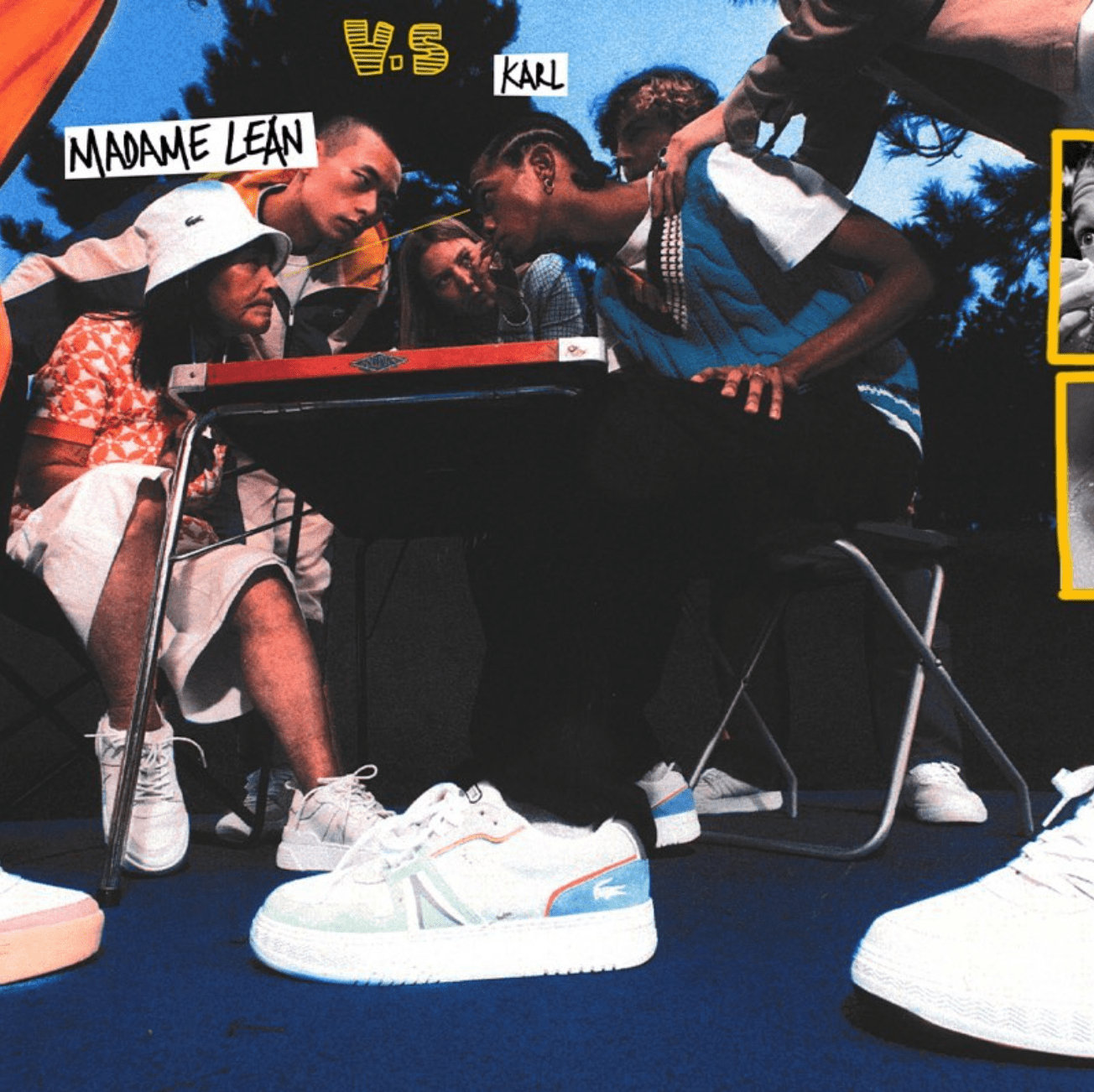
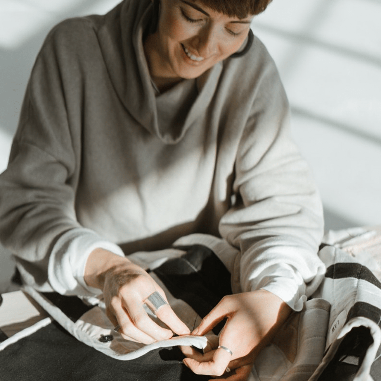
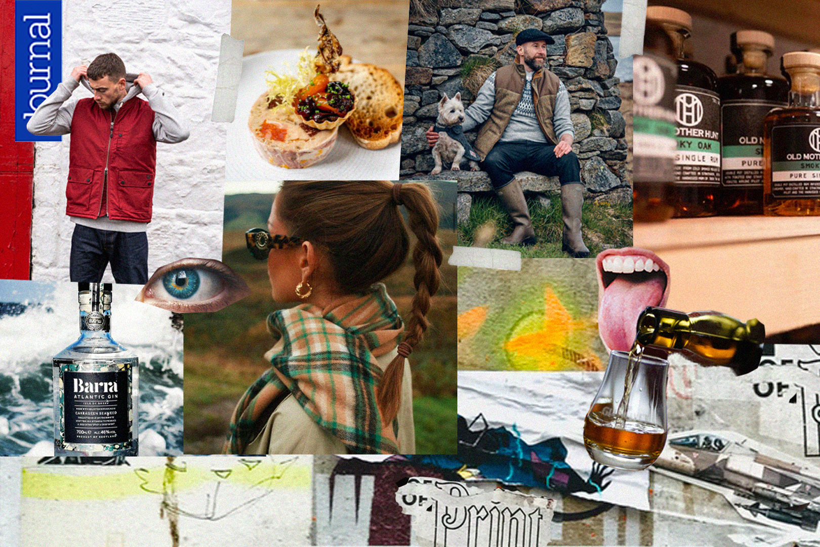
• Leaned heavily into high-quality, collaborator-provided imagery that gave the site a more authentic feel.
• Set up a new above the fold smart content block that auto-populated the three newest articles. We found that ~5 seconds per slide was the most effective for engagement.
• Created new categories / collections that made searching content by topic more straightforward.
• Built out features such as 'Explore More' and hierarchy on typography sizing on article pages that encouraged longer site engagement. These features were missing prior.
• Along with the rest of the writing / content team, helped build out a larger podcast library.
• Initiated a new naming convention and file compression system for uploaded content / imagery to lower file sizes, improve accessiblity and SEO, and increase page speeds.
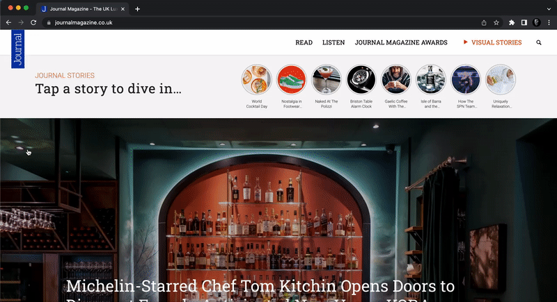
Above the Fold
The redesigned home page including a smart carousel that auto-populated the three newest articles. We found that ~5 seconds per slide was the most effective for engagement.
The redesigned home page including a smart carousel that auto-populated the three newest articles. We found that ~5 seconds per slide was the most effective for engagement.
User Flows and Interactions
The new user flow diagram highlighting an accessibility and interconnectivity from multiple starting points.
The new user flow diagram highlighting an accessibility and interconnectivity from multiple starting points.


Individual Page Redesigns
There was a focus on more interactive article pages, new section collections, and a more robust home page.
There was a focus on more interactive article pages, new section collections, and a more robust home page.
02. Refining Social Channels
__________________________
__________________________
Across social channels, there was a shift in visual identity and content strategy. To create a seamless experience across social channels and the publication, we adopted the same typeface as the web designs when needed (Roboto / Roboto Mono), and leaned heavily into high-quality, collaborator-provided imagery that gave the site a more authentic feel. To help grow the channel, we also adopted a more consistent posting schedule of 2-3x / week minimum.
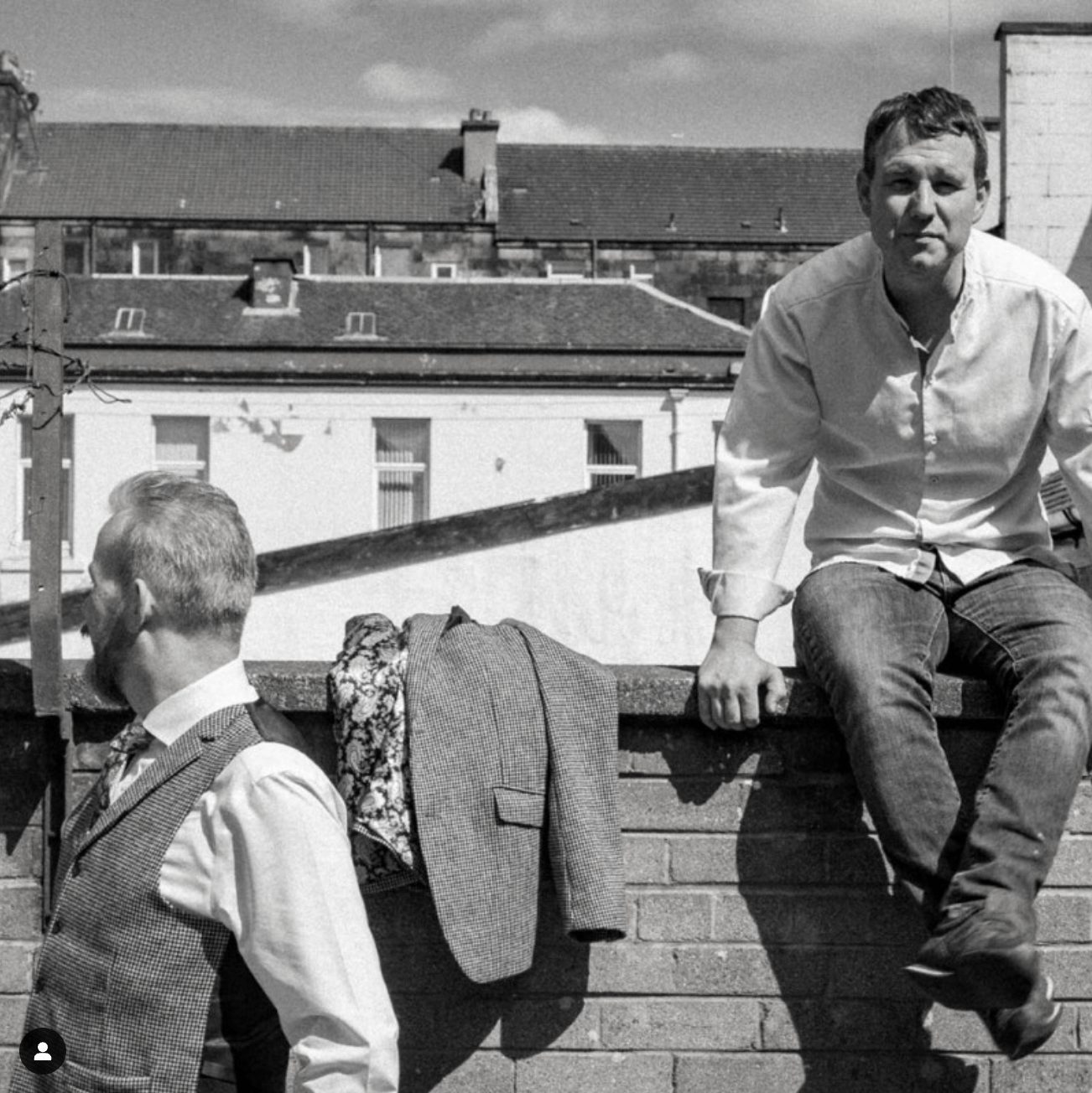
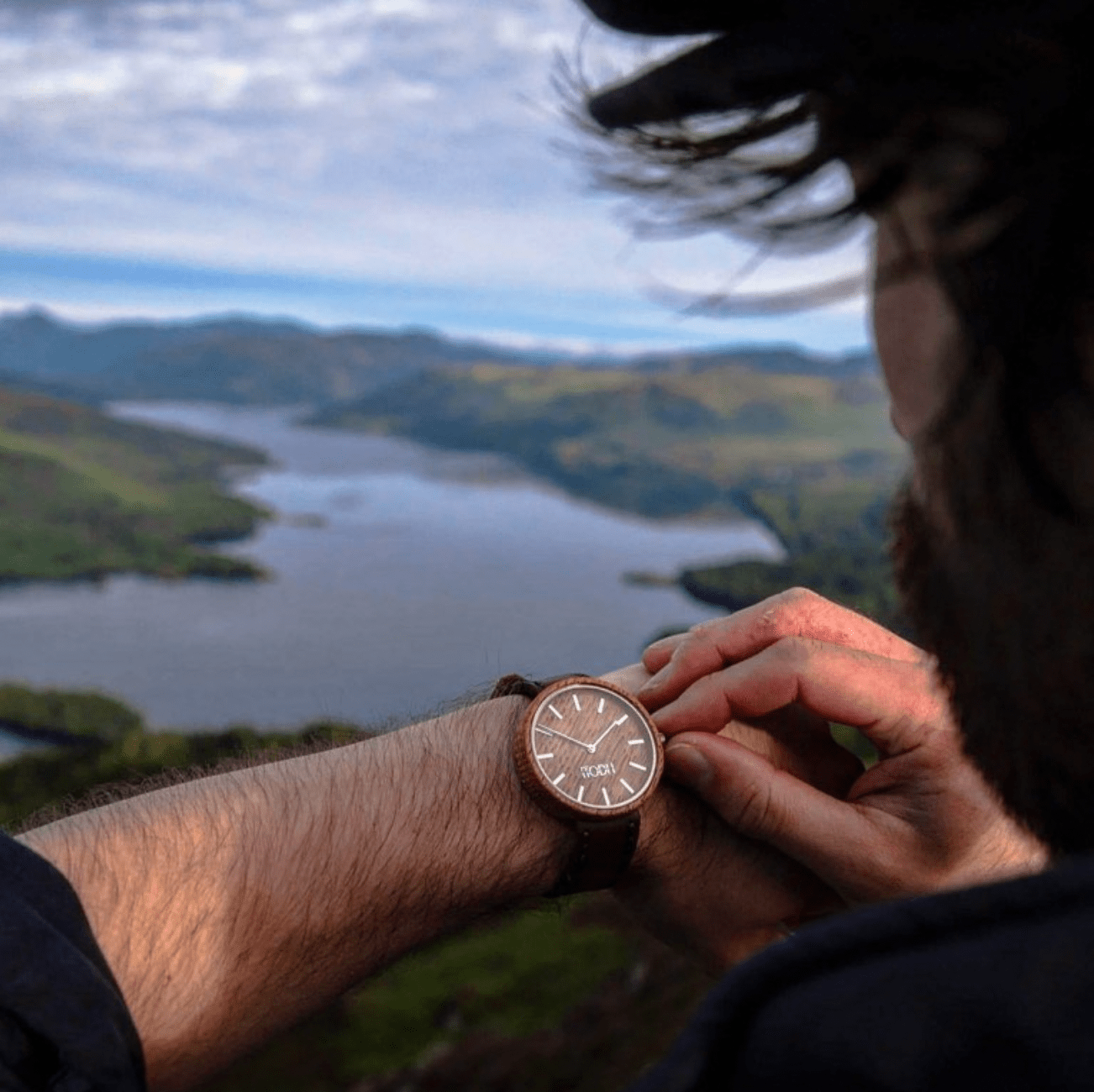
Imagery is arguably one of the most important, if not the identifying trait of publications. Whether looking at Vogue, Esquire, or Wired, publications are the waypoint for photographic and visual identity.
For Journal, I helped refine this identity by curating photography that we used across social channels. From collaborator imagery, I looked for authentic, lived-in photos that felt true to the brand. A few guides I used for our content team:
• Look for asymmetry
• Human-focused content (when possible)
• Unique angles
• Character – aged, attitude, context (we can all tell stock content from across the room, so this was perhaps the most important trait)
• Look for asymmetry
• Human-focused content (when possible)
• Unique angles
• Character – aged, attitude, context (we can all tell stock content from across the room, so this was perhaps the most important trait)

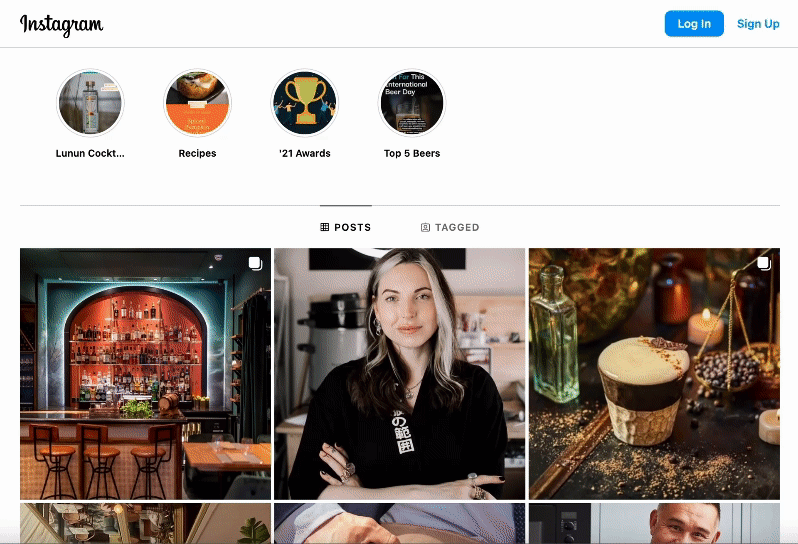
A Refined Social Content Strategy
A focus on incorporating branding elements from the website, along with high-quality imagery and a more consistent posting schedule helped grow our follower count to nearly 5,000 by mid July.
03. Diversifying Content
______________________
______________________
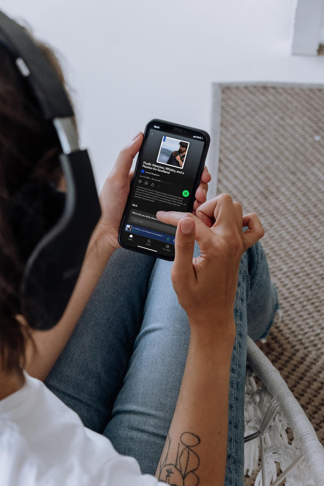
To continue growing the Journal's audience and create new ways to experience our content, along with the content writer and pr manager, I began developing the Journal Magazine Podcast series, highlighting movers and shakers across the UK.
As an ongoing monthly series, the goal was deep-dive conversations with small businesses and thought leaders across the UK. I was in charge of editing the podcast audio for length and clarity, recording the intro stings, and designing the static and motion graphics for sharing on social media. I also updated the website with the Spotify-supported embedded player when new podcasts were uploaded.

Results:
A few key highlights:
Over 3 months, bounce rate dropped from just over 60% to around 50%, a significant improvement.
We saw increased contacts for ad placements and feature collaborations, an indicator that our site presence was growing.
Our social followings grew about 10-15%, peaking at around 5,000 followers on Instagram (our primary channel)
_______________________________________________________
Helping clients, teams, and brands
bring creative visions to life.
bring creative visions to life.

Let's chat
If you’ve had the opportunity to view my work and would like to discuss working together, I’d love to hear from you.
© 2023 Scott Durbin